Booking reports turn your appointment activity into insight: how many bookings you took, how much revenue they brought in, how many turned into no-shows, and how well your team's capacity was used. They read from the same appointments you manage on the calendar, so there is nothing extra to fill in — book work as usual and the numbers build themselves.
These reports are written for owners and managers who want to see the shape of the business over a period and act on it: spot a rising no-show rate, find the services that pay, compare locations, or reward the staff who are busiest and best-reviewed.
Before you start
- Bookings must be switched on. These reports live under the appointment side of Nkapio. If your business doesn't take bookings, the section stays hidden — that's expected, not a fault.
- You need permission to view reports. Reporting is a permission your administrator grants per role. If you can't see Reporting → Bookings, ask whoever manages roles to enable it for you.
- Empty is normal at first. A brand-new period with no appointments shows "No data available". As soon as bookings fall inside the dates you pick, the cards and charts fill in.
Choosing a period
Everything on the page is scoped to the period you choose at the top. Pick a preset — Today, This week, This month, Last month, This quarter or This year — or type a custom range into the date field to compare any two dates you like. Switching the period reloads every card, chart and table beneath it.
There is no separate store or staff filter here: instead of filtering, you slice the same period through the tabs below (Staff, Services, Stores, and so on). On the Overview, the small up/down badges under each figure compare the current period against the one just before it, so you can tell at a glance whether things are moving in the right direction.
Overview
Reports → Bookings → Overview (/reports/bookings/overview) is the headline
dashboard. The KPI cards show total bookings, revenue, average value,
your no-show, cancellation and rescheduled rates, utilisation,
walk-in ratio, average rating and the number of reviews — each with a
comparison badge against the previous period. Below the cards, three charts show
the rhythm of your business: daily booking trends, peak booking hours,
and a revenue trend line.
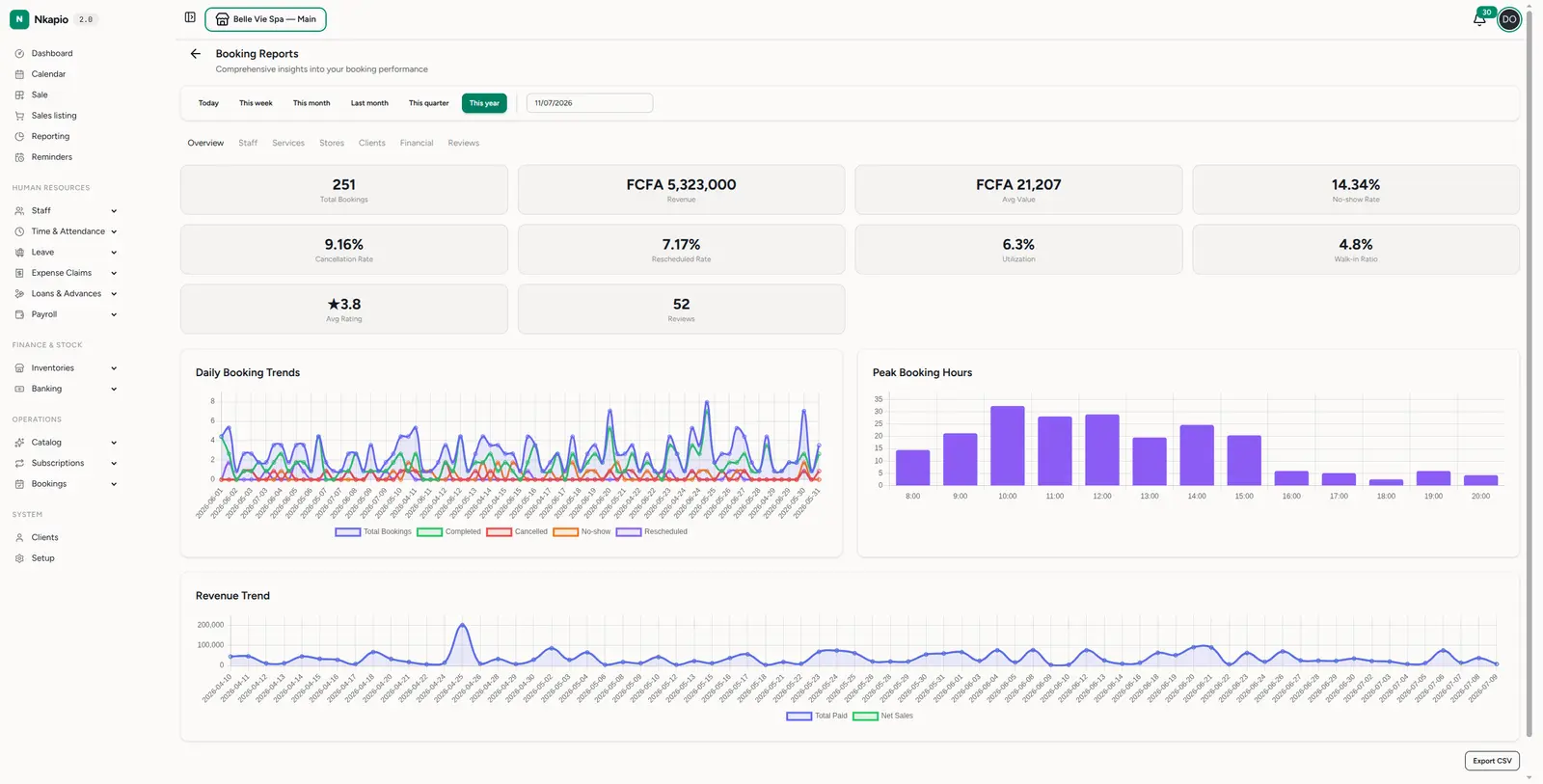
Read utilisation as a capacity gauge: a low figure means idle staff or empty slots, while a consistently high one is a sign you could add hours or raise prices. The no-show and cancellation rates are the leaks to watch — every point is revenue that was booked but never earned.
Break it down by tab
The tabs across the top re-cut the same period in different ways:
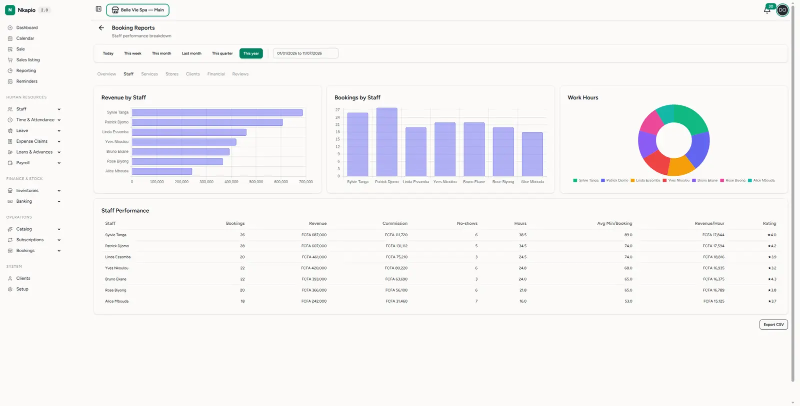
- Staff — bookings, revenue, commission, no-shows, hours worked, average minutes per booking, revenue per hour and rating for each team member. Charts rank your team by revenue, by volume and by hours, so you see who's busiest and who's converting.
- Services — which services drive volume and revenue, their average value, cancellation rate, rating and most-common add-ons. Handy for pricing and scheduling decisions.
- Stores — a like-for-like comparison of your locations: bookings, revenue, average value, utilisation, peak hour and top service per store.
- Clients — total, new and returning clients, average visits, repeat rate and average days between visits, plus a top clients table ranked by spend and visits.
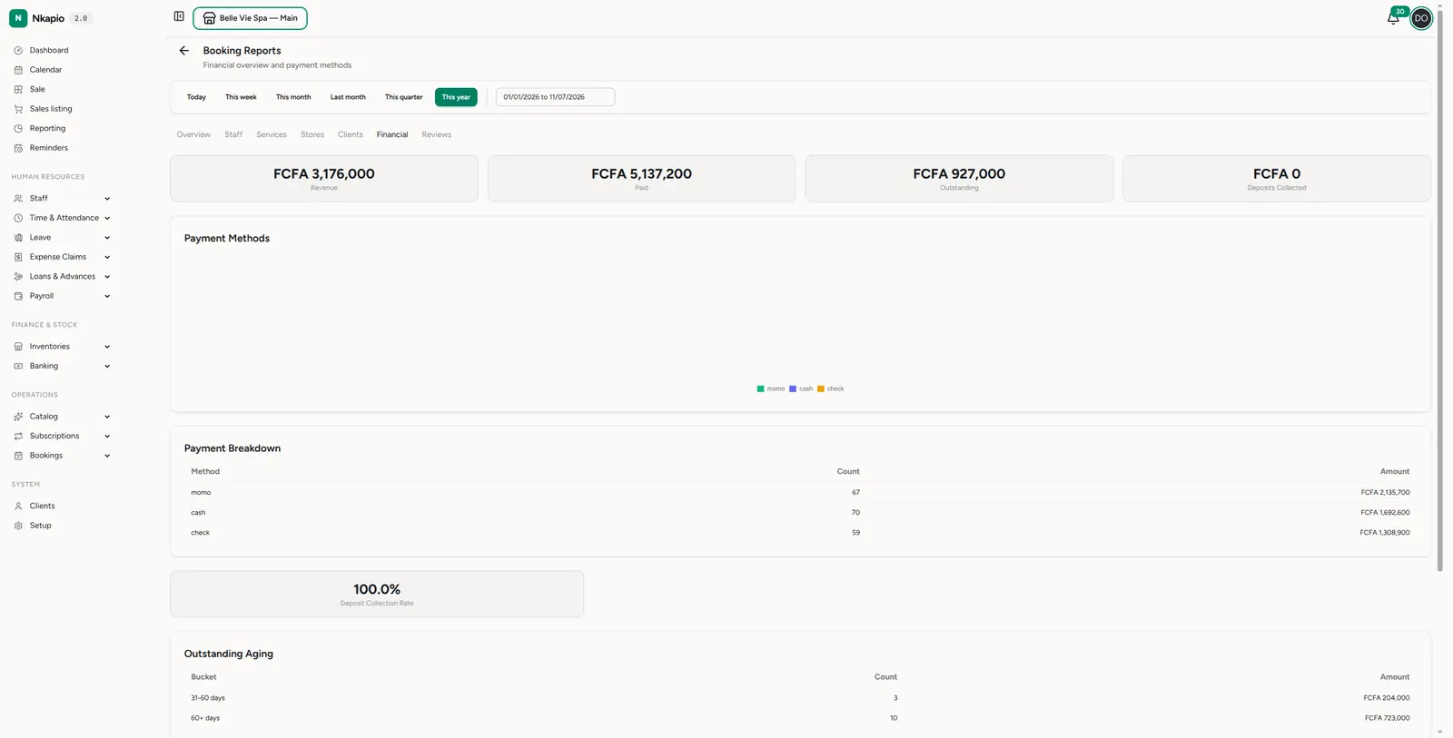
- Financial — the money view: revenue, paid, outstanding and deposits collected, a payment-method breakdown, your deposit-collection rate, an outstanding-aging table and a revenue trend.
- Reviews — the feedback tied to bookings: average rating, 5-star rate, count of low (1–2 star) ratings, a rating distribution, breakdowns by service and by staff, and the most recent comments.
Exporting
Every report has an Export CSV button in the bottom-right (on Reviews it's the Export button by the recent-reviews list). The download contains the rows for the period you're viewing — open it in a spreadsheet for deeper analysis, or share it with your accountant.
Tips
- Watch the no-show rate. A rising rate is money left on the table; automatic reminders are the usual fix.
- Use utilisation to plan capacity. Low utilisation means idle staff or slots; high utilisation may mean you can raise prices or add hours.
- Compare like with like. The comparison badges pit each period against the one before it, so choosing "This month" versus "Last month" tells a clean story.
- Check the Financial tab's aging. Outstanding balances grouped by age tell you which unpaid bookings to chase first.
FAQ
Why is a report empty? There were no bookings in the dates you picked, or your role doesn't have reporting permission. Widen the period or ask an administrator to grant access.
Can I filter by a single staff member or store? Not with a filter — open the Staff or Stores tab instead, which breaks the whole period down per person or per location.
Do the figures include cancelled and no-show bookings? Rates and counts account for them explicitly (that's what the no-show, cancellation and rescheduled rates measure); revenue reflects what was actually earned.